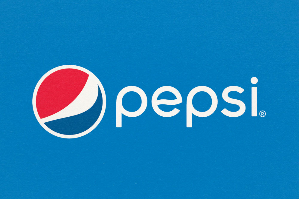
Logotype Update for Pepsi
In 2012 I had the pleasure of working with the incredible design team at Tether Inc. to help refresh the brand of a little soda company called Pepsi.
When they brought me on board they had already done so much inspiring work in the conceptual and strategic realms, and I was very lucky to be able to contribute my years of experience designing type to construct a new Pepsi wordmark from scratch.
My instincts told me that the update had to be a small step forward, so I chose to honor all the foundational aspects of their prior logotype, but rejuvenate it with a friendlier, more geometric approach, which resulted in a more modern and welcoming logo.
After the logotype was updated, Tether went on to do some incredible work reimagining the bottle form and various packaging solutions. Tether is full of so many smart, talented people, it was a pleasure to work with their creative leadership, as a designer I grew tremendously during my short stay.
“Corianton is one of those rare designers that turns everything he touches into gold. His natural creative intuition combined with his wide-open attitude towards daily life give him a unique perspective that, in turn, drives unique solutions.”
— Kari Strand, Creative Director, Tether